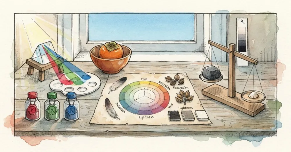
Every colour on the web is three numbers describing how much red, green and blue light to emit. The notations differ; the colour does not.
HEX is RGB in base 16
#2563eb is three pairs of hex digits. Each pair is one channel, 00 to ff, which is 0 to 255 in decimal.
25= 37 red63= 99 greeneb= 235 blue
So #2563eb and rgb(37, 99, 235) are identical. Converting by hand is just reading each pair as base 16.
Three-digit codes are shorthand where each digit doubles: #f00 expands to #ff0000. It only reaches 4,096 colours, so it is useful for primaries and not much else.
Eight digits add alpha: #2563eb80 is that blue at roughly 50% opacity. Modern CSS also accepts rgb(37 99 235 / 50%), which does the same thing more legibly.
HSL is for building palettes
HSL describes the same colour as three perceptual properties:
- Hue - position on the colour wheel, 0 to 360 degrees
- Saturation - how far from grey, 0 to 100%
- Lightness - 0% is black, 100% is white, 50% is the pure hue
#2563eb is hsl(221, 83%, 53%).
The reason this matters: to generate a set of tints and shades of one colour, hold hue and saturation constant and vary lightness. hsl(221, 83%, 95%) down to hsl(221, 83%, 15%) gives a coherent ramp in one line. Doing the same in HEX means guessing at 24 hex digits and getting a ramp that drifts in hue.
Every design system that generates colour scales does it in HSL or a perceptual space like OKLCH, never in HEX.
OKLCH, briefly
HSL has a real flaw: equal lightness values do not look equally light. hsl(60, 100%, 50%) (yellow) is visibly brighter than hsl(240, 100%, 50%) (blue), despite both claiming 50%.
OKLCH fixes this by being perceptually uniform, and it is supported in every current browser. If you are building a colour system now, it is the better choice. HSL remains fine for adjusting a colour you already have.
Contrast ratios
Contrast is computed from relative luminance, which weights the channels according to how sensitive the eye is to each: red 0.2126, green 0.7152, blue 0.0722. Green dominates, which is why green text on white fails contrast checks more easily than intuition suggests.
The ratio is (lighter + 0.05) / (darker + 0.05), running from 1:1 to 21:1.
WCAG thresholds:
- 4.5:1 - body text, AA
- 3:1 - large text (18pt, or 14pt bold) and UI components, AA
- 7:1 - body text, AAA
Brand colours frequently fail. A mid-tone brand blue on white often lands around 3.5:1, which passes for headings and fails for body copy. The usual fix is to darken the text variant of the brand colour and keep the original for backgrounds and accents.
Colour profiles
Screenshots and photographs are often in Display P3 or Adobe RGB, wider gamuts than sRGB. A canvas reads sRGB values, so a colour picked from a P3 screenshot will not exactly match what a design tool reports.
For web work this is rarely a problem, because the web is sRGB by default. It matters when you are matching a printed brand colour, where you want the Pantone or CMYK reference rather than a picked pixel.
Convert between notations, or lift a colour from an image, with the HEX to RGB converter and the image colour picker.